KemConnect turned plant data into an operating surface people could trust.
A bespoke industrial decision-support platform for water-treatment teams working under operational pressure.

55% less chemicals · +26% TSS capture · Paris Olympics
KemConnect sits inside municipal and industrial water-treatment operations where operators are balancing chemical dosing, process stability, and plant performance in real time. The challenge was not to make the software look modern. It was to turn complex process data into decisions people could trust quickly.
My work focused on the operator-facing product surface: dashboard composition, multiview workflows, edit and view states, and a research-led PLC redesign that clarified how the system should behave closer to the machine layer.
55%
Chemical reduction
+26%
TSS capture increase
6%
Energy reduction
Paris Olympics 2024
Notable deployment
The interface had to reflect operator tasks, not just the underlying system architecture.
Earlier views were dense, hard to interpret, and not always grouped around the way people actually worked. Interviews and navigation analysis exposed a recurring problem: less technical users struggled to understand truncated labels, locate critical actions, and predict the consequences of what they were changing.
That research changed the framing of the work. Instead of shipping more screens, the product had to be reorganised around the moments operators actually care about: status checking, setup and commissioning, maintenance, troubleshooting, and the transition from overview to deeper investigation.
This was the strategic shift: designing for confidence under pressure, not just information density.

Earlier control view: functional, but heavy and tightly coupled to device logic.

Navigation audit: mapping how views and functions were scattered across the existing product surface.
The product’s center of gravity became configurable, structured, and easier to steer.
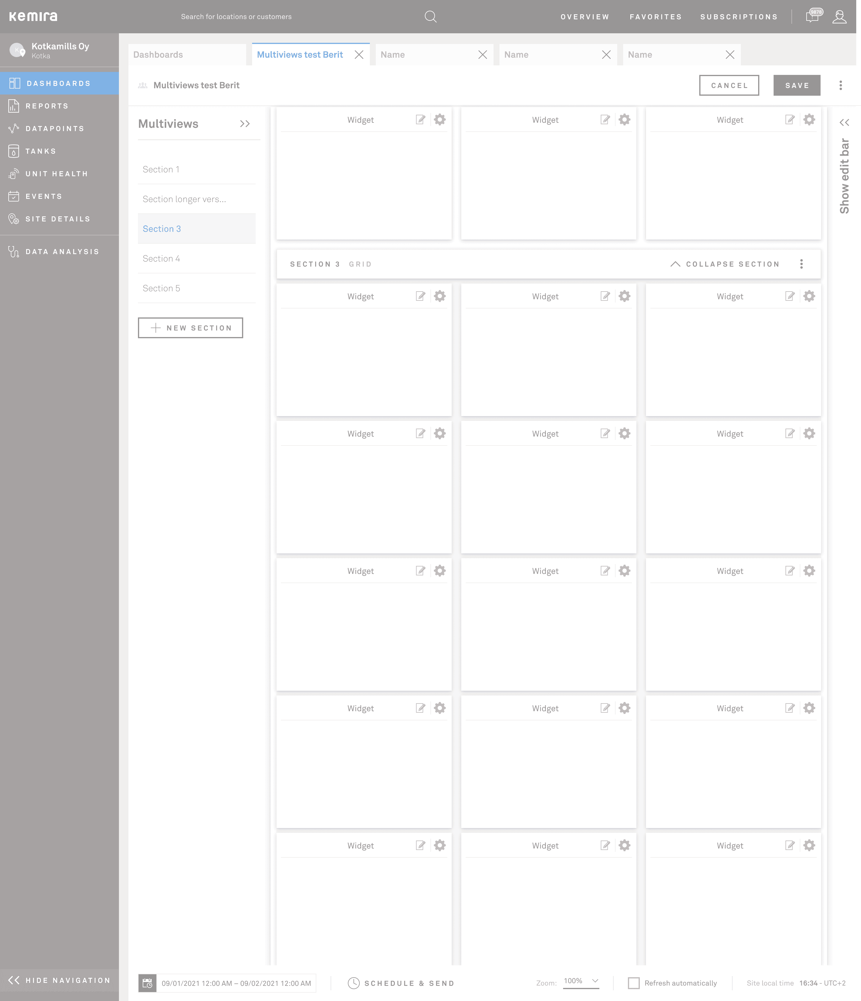
KemConnect needed more than static dashboards. Operators and customer teams needed to compose their own working views, combine widgets that mattered for a given plant, and move between overview and deeper analysis without losing context.
The grid system solved two problems at once: it made the product more flexible for different operational scenarios, and it created a more legible structure for the interface itself. The result reads less like a set of disconnected tools and more like a deliberate operating surface.

Configurable grid dashboard with a widget library built into the editing flow.
%402x-2.png&w=3840&q=75)
Multiview composition: multiple sections supporting different monitoring jobs inside one dashboard.

Control chart picker: operators choose the right visualisation for their monitoring context.
Edit mode, quick navigation, and live views were designed as one continuous workflow.
The important design problem was not just creating an edit screen. It was preserving orientation while people moved between composing the dashboard and using it live. Sections, quicklinks, and edit controls needed to clarify where the operator was and what would happen next.
This is where the interface moved beyond a gallery of widgets. Edit mode, multiview structure, and quick access patterns became part of the decision-support model itself.
Quicklinks reduced navigation friction between views inside complex dashboards.
%402x-5.png&w=3840&q=75)
Edit mode kept structure visible while exposing widget, datapoint, and filter controls.
The broader product surface matured into a coherent system, not a loose collection of tools.
The final UI work shows that the design language carried beyond dashboards. Navigation, tables, selection patterns, and analysis surfaces aligned into a calmer, more scalable product layer that still felt industrial and precise.
For the portfolio page, the screenshots stay selective. The point is not to exhaustively show every screen. It is to demonstrate that the interaction model held together across the wider product.

Dashboards as a navigable product surface, with clearer layout modes and operational ownership.

Health monitoring expanded the same visual language beyond dashboard composition.

Analysis surfaces aligned with the same typographic and structural language as the dashboards.
A PLC UI redesign condensed the same thinking into a tighter machine-level problem.
Alongside the platform work, I also worked on a PLC redesign that made the research-to-redesign chain explicit. Four user interviews surfaced ambiguity in labels, poor task grouping, and uncertainty around the consequences of user actions.
That led to a tighter redesign arc: clarify the main use cases, reorganise navigation around actual tasks, define safer permissions and contextual help, and then translate the system into a more deliberate interface language.

Research results: concrete pain points from four user interviews.

Task-led structure: regrouping the UI around setup, maintenance, troubleshooting, and status.

Final proposal set: the redesign expressed as a coherent, usable interface system.
The value of this work was not visual novelty. It was making complex industrial software feel dependable enough that operators could act on it with confidence.
MODES UI Design System →
Metso